Look at the digital identities that genuinely feel premium today and a pattern emerges. They aren't styled like SaaS — they're styled like publications. Editorial design has migrated from print into product surfaces, and the brands that adopted it early are pulling away.
What Editorial Design Actually Is
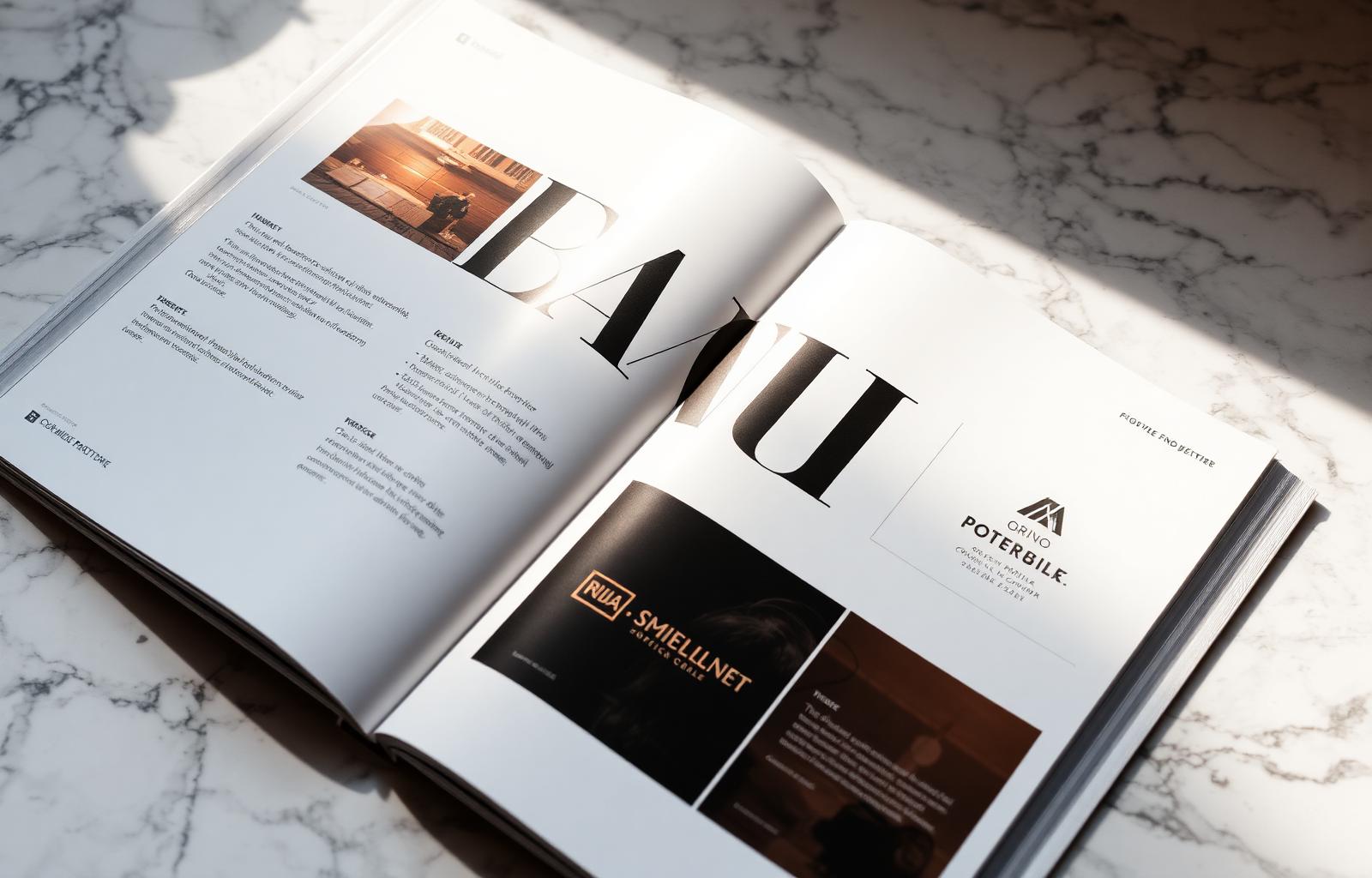
The term gets borrowed loosely, so precision matters. Editorial design, as practiced in publications like The New York Times Magazine, Monocle, or MIT Technology Review, is the discipline of composing content in space — deciding how type, image, white space and structure work together to direct attention, establish hierarchy, and create a reading experience that feels considered at every level. It is not a visual style. It is a decision-making methodology applied to every surface a reader encounters.
When this methodology migrates to digital product, the result is a brand that communicates authority through restraint, craft through precision, and respect for the reader through generous spacing and typographic clarity. Template design communicates efficiency of production — the exact quality premium buyers are trying to decide you don't represent.
The Five Principles of Editorial Design Applied to Digital
1. Typography as the Primary Brand Signal
In editorial design, type does not support the brand — type is the brand. A publication like The Atlantic is recognizable at a glance without a logo because its typographic voice is that distinctive. For digital brands, this means investing in a type system with genuine range: a display face strong enough to own a hero section, a body face designed for sustained reading at 16–18px, and an accent face that creates contrast without visual noise. The mistake most teams make is licensing a single geometric sans-serif and using it at every size, weight and context. The result is a brand that feels technically consistent but emotionally flat.
2. Grid as Composition, Not Constraint
Editorial designers use grids not to make pages look aligned but to create tension and release — the visual rhythm that pulls a reader forward. The centered, symmetric layouts that dominate SaaS marketing sites have no rhythm. They have symmetry, which is a different thing, and a far less interesting one. A strong editorial grid creates deliberate asymmetry: a headline that bleeds into the margin, an image that spans three-quarters of the grid while text occupies one quarter, a pull quote that forces a pause.
3. Photography as Editorial Content
Generic stock photography signals that a brand has not thought hard about its visual identity. Editorial design treats photography with the same intentionality as the writing: images are commissioned or curated to carry a specific mood, point of view, and relationship to the surrounding text. Brands that invest in a consistent photography art direction — a specific color palette, a specific relationship between subject and negative space — build visual equity that accumulates across every asset they publish.
4. Whitespace as Structure
The most counter-intuitive principle for teams trained in digital product development is that empty space is not wasted space — it is structural. In editorial composition, whitespace groups related elements, separates unrelated ones, signals hierarchy, and gives the eye a place to rest before the next focal point. SaaS landing pages chronically compress whitespace in the belief that density signals value. The brands that feel premium do the opposite.
5. Voice as Visual Element
The written voice of an editorial brand is inseparable from its visual identity. A brand that writes in passive, hedged corporate prose cannot rescue that voice with good typography. The editorial brands that pull away write with specificity, personality and a clear point of view. The copy is direct, occasionally opinionated, and treats the reader as an intelligent adult.
Editorial design is the difference between a website that loads and a website that lingers — between a brand that is remembered and a brand that is merely recognized.
Editorial Brand vs. Generic SaaS Brand: A Side-by-Side
| Dimension | Editorial Brand | Generic SaaS Brand |
|---|---|---|
| Typography | Multi-weight system, distinct display and body faces | Single geometric sans at all sizes |
| Layout | Asymmetric, grid-precise, intentional tension | Centered hero, three-column cards, footer |
| Photography | Art-directed, consistent mood and palette | Generic stock, interchangeable across brands |
| Whitespace | Generous, structural, signaling confidence | Compressed to maximize above-the-fold content |
| Copy voice | Specific, opinionated, treats reader as adult | Passive, hedged, feature-listing |
| Color system | Tight palette used with discipline | Brand blue applied indiscriminately |
| Scroll experience | Paced, reveals information at narrative rhythm | Features stacked for completeness, not flow |
| Brand recall | High — distinctive at a glance | Low — interchangeable with category peers |
Implementation Roadmap for a Real Team
Phase 1: Typography and Voice Audit (Weeks 1–3)
Before touching a single component, inventory every typeface in use across your product, marketing site, and sales materials. You will almost certainly find six to twelve fonts in play — the result of years of ad hoc decisions. Narrow to two, maximum three. Then audit the written copy: Is it specific? Does it have a point of view? Could a competitor publish this sentence without changing a word?
Phase 2: Grid and Spacing System (Weeks 4–7)
Define a base grid that will govern every layout decision going forward. For most digital brands, a 12-column grid with 24px gutters and a base-8 spacing scale provides enough flexibility for editorial asymmetry while maintaining system consistency. Document the grid as CSS custom properties that developers can implement without interpretation — the gap between design intent and engineering execution is where editorial systems most commonly collapse.
Phase 3: Photography Art Direction and Component Rebuild (Weeks 8–12)
Commission or curate a library of 20–40 images that represent the visual world your brand wants to inhabit. Brief photographers with specific technical parameters: color temperature, depth of field, relationship between subject and negative space. Then rebuild your highest-traffic components using the new type scale, grid and imagery simultaneously. Rebuilding components together against a shared reference produces a system; rebuilding them individually produces incremental improvement.
Tooling for the Editorial Stack
Figma remains the dominant design environment and is adequate for editorial work when used with proper variable systems and auto-layout discipline. For type, the most productive sources are Klim Type Foundry, Grilli Type, and Commercial Type — foundries whose licenses are structured for digital brand use. For component documentation, Storybook with MDX pages provides an editorial-quality design system reference that developers actually use. The tools are not the bottleneck; the decisions about what the tools should implement are.
The Business Impact: What the Metrics Show
What we can observe from brands that have made the transition: average session duration increases 30–50% within six months of an editorial redesign, driven by the reading experience rather than content changes. Enterprise sales teams report shorter sales cycles on deals where the prospect had independently explored the website — the design communicates credibility before the sales conversation begins. And inbound talent applications from designers and writers increase sharply, because people who care about craft want to work at brands that demonstrate care for craft.
Frequently asked
Doesn't editorial design slow teams down?+
Only if treated as bespoke per page. Mature editorial systems use a flexible grid, a strong type scale, and a small library of compositional patterns — fast to ship, premium in feel.
What's the minimum budget to get started?+
The highest-ROI starting investment is type: licensing a distinctive typeface for $500–$2,000 and applying it consistently across your highest-traffic surfaces creates more perceptual shift than a full redesign built on the wrong type system.
How do we sell editorial design investment to leadership?+
Lead with the sales cycle data. Brands with editorial-grade design consistently show shorter enterprise sales cycles — the design communicates credibility before the sales conversation begins. Frame it as sales infrastructure, not aesthetics.