Building Premium Digital Brand Experiences
Premium is not a finish. It is a discipline. The most desirable digital brand experiences in the world share a small set of structural decisions — restraint, choreography and confidence.
What Actually Makes Something Feel Premium
The word "premium" is abused in brand briefs. Premium is not a collection of design assets — it is a set of decisions about what to exclude. The brands that feel genuinely premium in digital environments have made fewer choices than their competitors, and every choice they have made is deliberate, consistent, and load-bearing. You cannot arrive at premium by adding quality signals. You arrive there by removing everything that is not essential until what remains is irreducible.
Examine the digital presence of brands that hold premium positioning — Bottega Veneta, Linear, Stripe, Apple, Notion. None of them are decorated. All of them are composed. In a composed experience, every element earns its place by serving a specific communicative function. Nothing is there because it felt good in isolation.
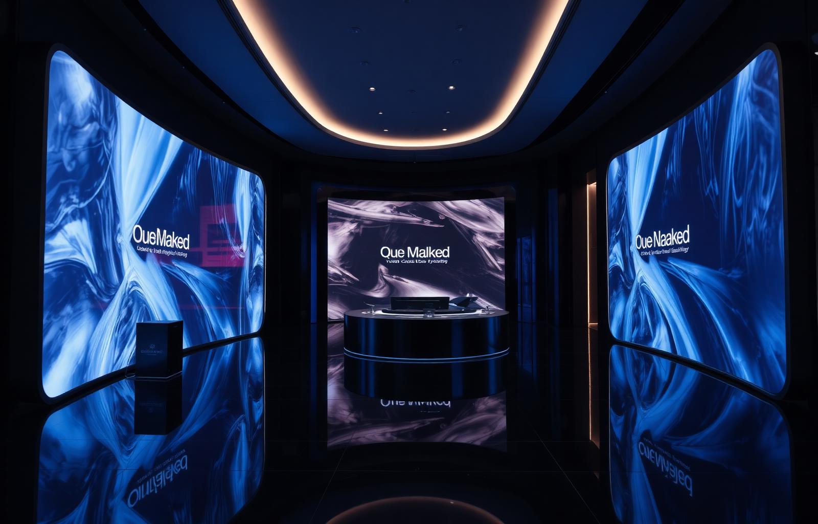
The Five Elements of Premium Digital
1. Restraint
Restraint is the hardest element because it requires ongoing editorial discipline. Every stakeholder will request additions — another section, another testimonial, another feature highlight. The premium brand says no. The home page of a premium brand has one primary message and creates a gravitational pull toward one primary action. If you can identify three equally prominent calls to action on your home page, you do not have a premium brand — you have a committee's home page.
2. Typography
Typography is the element that most separates premium from commodity at a distance. The premium typographic system has range — a display face with genuine character, a reading face with exceptional legibility at body sizes, and a size scale with enough steps to create compositional hierarchy without requiring imagery to do the heavy lifting. Generic system font stacks and off-the-shelf Google Fonts pairings are recognizable precisely because they are everywhere.
3. Motion
Motion in premium digital experiences is not decoration — it is choreography. Every transition communicates something. Premium motion is slow enough to feel intentional, consistent in its easing curves, and purposeful in its directionality. A premium brand has a motion language — a set of animation conventions used consistently across every surface — rather than a collection of individually chosen transitions.
4. Sound
Sound is the emerging frontier of premium digital. Interface sounds, when designed with restraint, reinforce physical quality analogies: the soft click of a toggle, the subtle chime of a successful transaction. The risk is high — poorly executed sound is immediately grating — but the brands that have gotten it right have created a sensory dimension of brand identity that is impossible to replicate without the underlying sound design investment.
5. Information Density
Premium brands control information density with the same rigor they apply to visual elements. They do not show everything they know. They reveal information in sequences calibrated to building understanding rather than demonstrating capability. The cognitive load of a premium digital experience is low not because the brand is simple, but because the complexity is hidden behind a surface that only exposes what the user needs at each step.
Luxury is the absence of compromise — the visible evidence that someone refused to ship the easier version and waited for the right one.
Auditing Your Current Brand for Premium Signals
A rigorous premium brand audit examines six surfaces: the home page above the fold, the primary navigation, a content page, a product or service detail page, a checkout or conversion flow, and a mobile experience on a mid-range Android device. For each surface, evaluate five dimensions: visual hierarchy, typographic quality, motion behavior, information density, and negative space. Score each dimension on a 1–5 scale and identify the lowest-scoring dimensions as priority investment areas.
Common Premium Killers
- Stock photography: nothing communicates commodity faster than a Shutterstock image of a diverse team in a glass-walled conference room. Premium brands invest in original photography or illustration-based alternatives.
- Generic fonts: Montserrat, Open Sans, and Lato are not premium. They are the Google Fonts era's commodity typefaces — ubiquitous because they are free and acceptable, not because they are distinctive.
- Crowded layouts: the instinct to fill every pixel is the single most common premium killer. White space is not wasted space — it is the signal that the brand does not need to compete for your attention because it has already earned it.
- Inconsistent motion: a page where some elements animate on scroll, some fade in, and some appear instantly without consistent logic reads as unfinished. Inconsistency in motion is the equivalent of inconsistency in color.
- Misaligned brand voice: a visually restrained layout with energetic, hyperbolic copy creates cognitive dissonance. Premium brands maintain the same editorial restraint in their writing that they apply to their visual design.
| Dimension | Premium Brand Signal | Commodity Brand Signal |
|---|---|---|
| Typography | Licensed or custom typeface with range and character | Montserrat, Open Sans, or system font stack |
| Photography | Original photography with consistent visual world | Shutterstock lifestyle imagery, diverse stock teams |
| Layout | Asymmetric, breathing, with intentional negative space | Symmetric grid, fully packed, minimal white space |
| Motion | Consistent language, purposeful easing, slow reveals | Mixed or absent animations, default CSS transitions |
| Color | Tight palette, used with discipline and constraint | Multiple accent colors, gradient overuse |
| Copy voice | Specific, confident, evidence-led, editorially restrained | Enthusiastic, hyperbolic, generic value propositions |
| Information density | Progressive disclosure, one focal point per section | Everything surfaced at once, competing for attention |
| Navigation | Minimal items, confident hierarchy, no mega-menus | Overcrowded nav, multiple CTAs, utility links competing |
Building a Premium Design Brief
A premium design brief defines the specific design decisions that will create premium perception, along with the rationale for each. A well-structured premium brief includes: a typographic system specification with approved weights and sizes at each level of hierarchy; a motion language document defining easing curves, duration ranges, and directional conventions; a negative space ratio guideline; a photography brief that describes the specific visual world the brand inhabits; and a copy voice specification that describes the editorial register, sentence length, and vocabulary constraints.
Implementation Priority Order
If you are rebuilding a digital brand for premium perception, the sequence matters. Begin with typography — it affects every surface and creates the most immediate perceptual shift. Then establish the motion language and apply it consistently across your highest-traffic page types. Then address photography and imagery. Then audit and reduce information density on your primary conversion pages. Finally, address negative space — which often requires redesigning layouts rather than just adjusting padding.
Frequently asked
How do we maintain premium positioning as the team scales and more people contribute to the design?+
The answer is governance, not policing. A well-documented design system with clear decision-making principles — what requires design approval, what can ship without it — is more effective than any review process at preserving premium positioning as team size grows.
Is premium digital design achievable for a company without a dedicated design team?+
Yes, with focused investment. A company with one designer can achieve premium positioning by focusing exclusively on the three highest-impact areas: typography, whitespace, and photography. Do those three things well and your site will feel premium even with simple components.